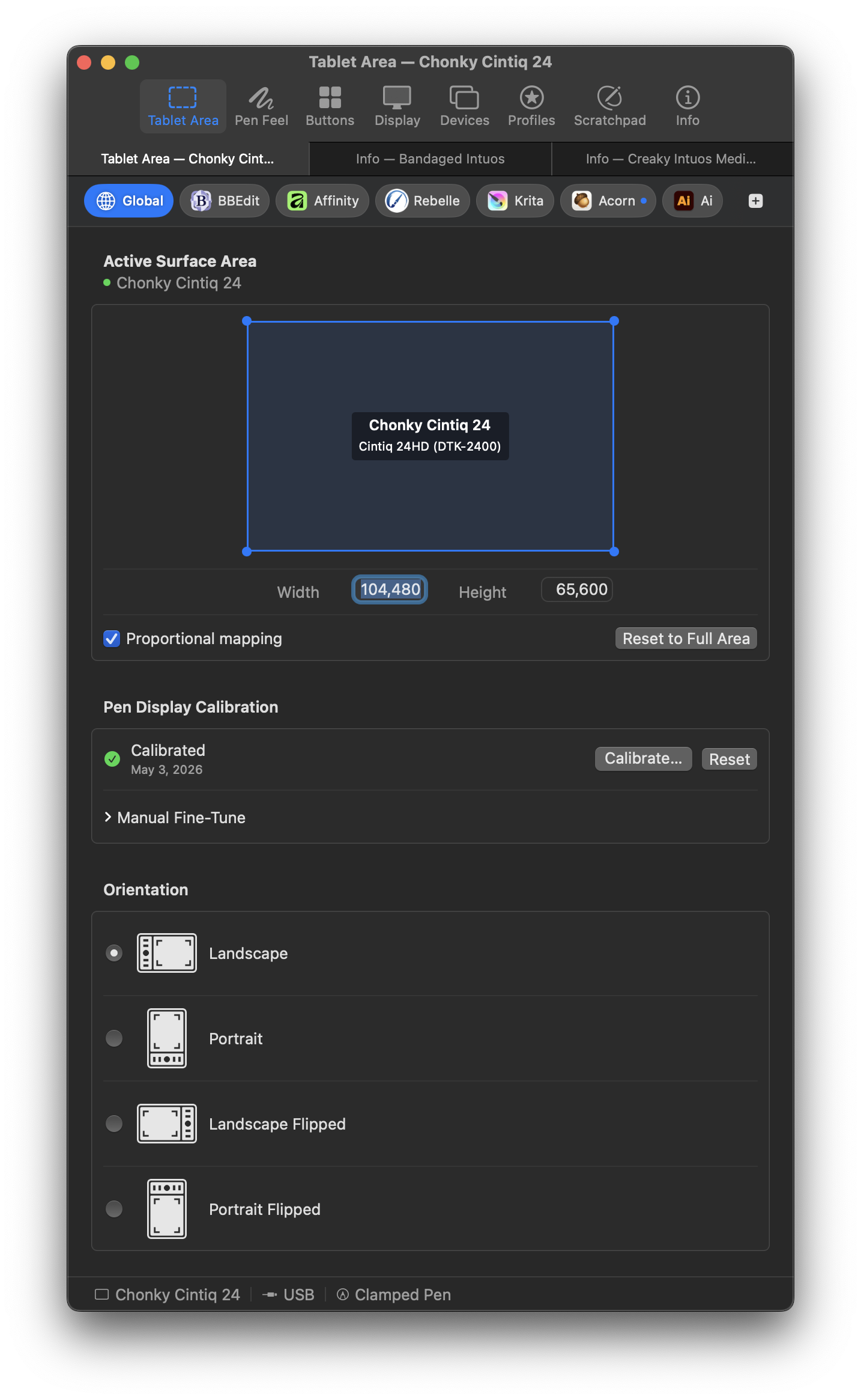
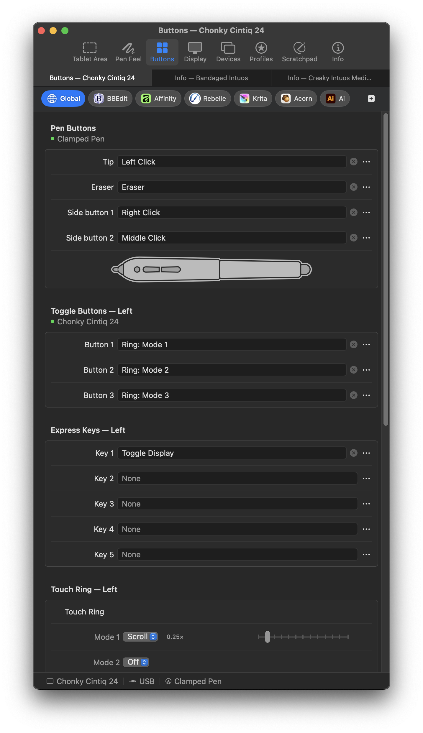
MockTab is a native Mac driver for older Wacom drawing tablets that no longer have official support on macOS. (It also works with some recent devices from Xencelabs.) Testing has covered only a limited set of hardware configurations so far, but the project shows potential for expansion.
Free and open source.
Screenshot: tablet view and orientation preferencesScreenshot: tablet button assignments
The app icon uses live Illustrator effects that keep its underlying wireframe fairly simple.
Trimble SketchUp Pro can generate 3D terrain models using elevation data from many regions around the world. Sometimes the resulting geometry needs cleanup and refinement for better flexibility. Below as a summary of how an application called Side Effects Houdini (a beloved procedural powerhouse of the visual effects and game industries) can help.
Ingredients:
Trimble SketchUp Pro19.1 (With internet access for geospatial data)
Side Effects Houdini 17.5 (Indie used here, but the free Apprentice might also be sufficient.)
Google Earth Pro for higher-resolution aerial images (texture mapping is beyond the scope of this particular discussion.)
Summary:
Obtain terrain geometry using SketchUp.
Import SketchUp’s terrain data into Houdini.
Clean and and refine terrain using Houdini’s virtually limitless toolset.
Import the refined terrain back into SketchUp.
Get Terrain
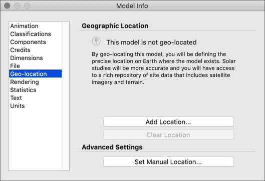
First, fetch some terrain data, which in this case originates from SketchUp’s Geographic Location network service. (This appears to require a paid version of SketchUp Pro, as Trimble no longer offers a standalone version like SketchUp Make.)
This SketchUp model has no association with any physical place on earth.
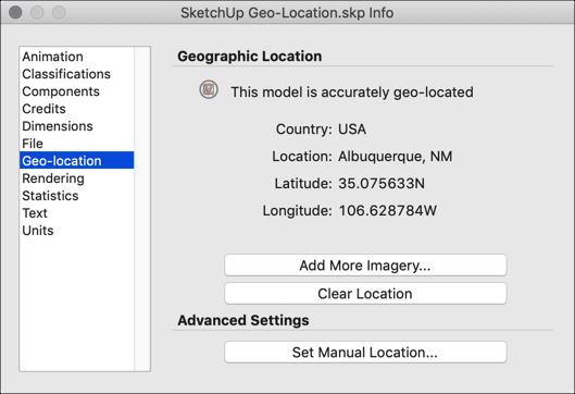
This SketchUp model is geolocated, or linked to some real-world coordinates.
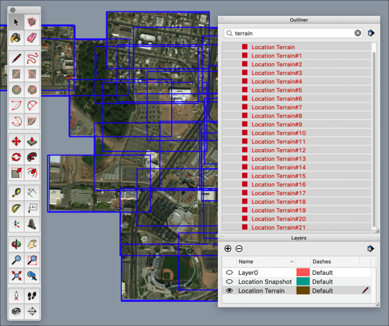
Pressing the “Add More Imagery…” repeatedly might lead to a more data density than necessary. Each blue tile is a discrete object with no knowledge of its neighbors. Redundancy abounds.
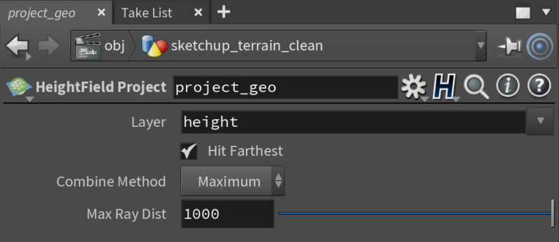
Untidy SketchUp terrain. Note the haphazardly overlapping tiles.
These tiles could benefit from some reorganization. To begin, unlock each of the “Location Terrain” geometry objects, then select them. (Note: the 3D layer is called “Location Terrain,” not “Location Snapshot,” which just contains raster aerial images. And low resolution, at that.)
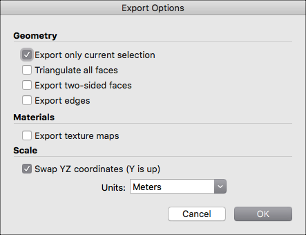
Next, choose File > Export > 3D Model… and specify a Wavefront geometry (obj) file format.
Export SketchUp selection as standalone .obj file.
In the Export Options dialog box, enable “Swap YZ coordinates” so that the Y axis points upward. Stick with meters as the units format. Enabling texture maps seems to be of limited use, as each tile gets its own jpeg file. (Houdini’s compositing system (COPs) could probably handle a procedure to recombine the individual images.)
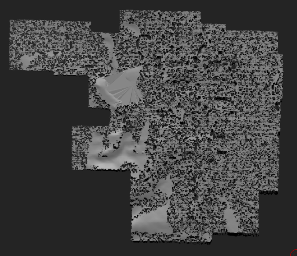
As an aside, routing the .obj file through Pixologic ZBrush’s DynaMesh system produced something resembling the aftermath of a termite infestation.
Pixologic ZBrush’s DynaMesh, SketchUp, and termites.
Clean Terrain
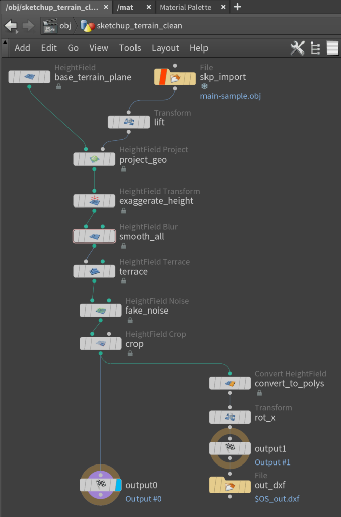
Below is a sample Houdini node network for importing the SketchUp terrain, cleaning it up, then exporting a refined version. This method harnesses Houdini’s heightfield model, a system of portraying detailed terrains using surface-like 2D volumes.
Houdini node network that attempts to refine terrain geometry.
The Heightfield Project operator can transmogrify messy geometry into a lean and orderly surface.
Make sure that the heightfield plane is large enough to accomodate the projected geometry.
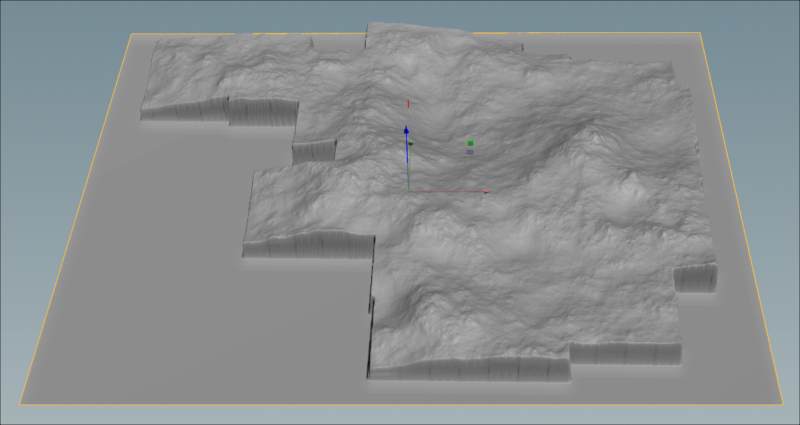
Houdini’s heightfield operators can emphasize major contours for illustrative purposes.
Terrain with pronounced contour lines using Houdini’s Heightfield Terrace node.
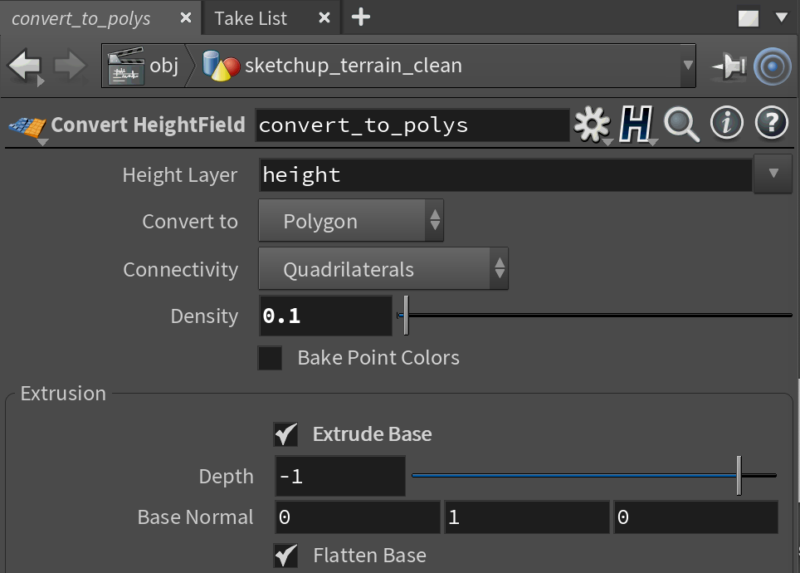
The final nodes in this network convert the terrain to polygons and saves the geometry as an AutoCAD Drawing Interchange Format file (dxf).
Bake the reconstituted terrain into conventional polygons for use elsewhere.
Back to SketchUp
Next, import the newly-minted dxf back into SketchUp. Enable drawing origin preservation to ensure that the freshened terrain slab remains positioned exactly where it should.
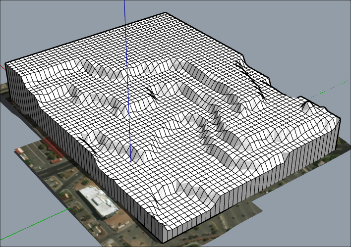
Import the new terrain geometry back into SketchUp.
Houdini terrain after SketchUp import.
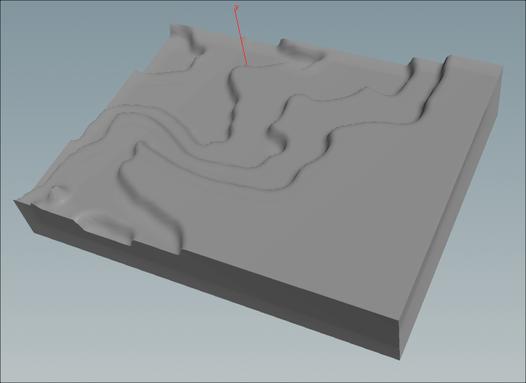
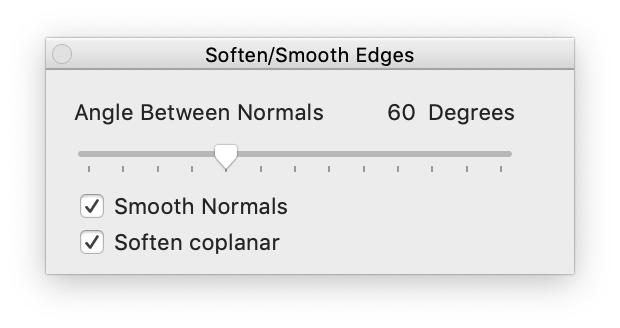
Finally, enable edge smoothing in SketchUp to hide the model’s gridlines and make the terrain look more natural.
Smooth the appearance of the terrain’s surface in SketchUp.
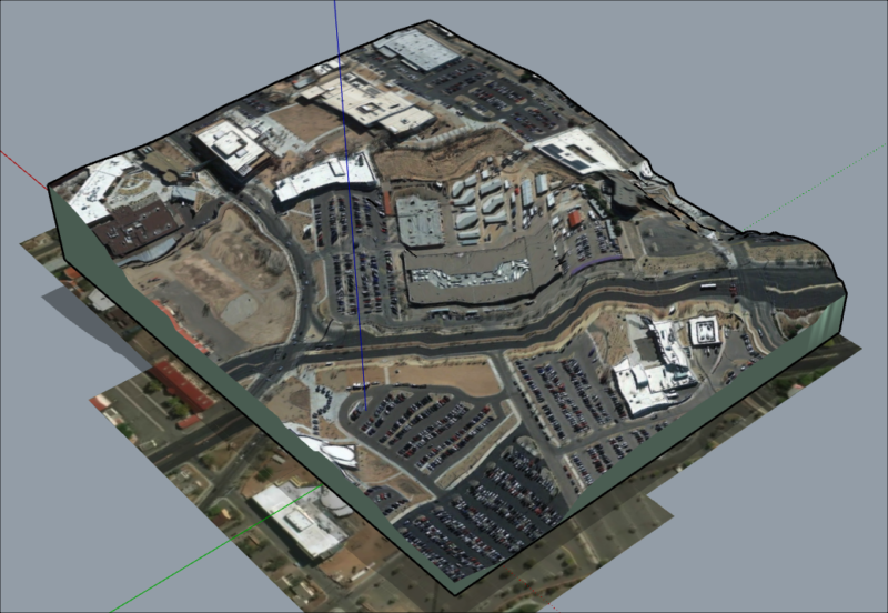
Optionally, project a higher-quality aerial texture onto the fresh terrain. Google Earth Pro can be a good source for such imagery. (SketchUp’s finicky process for texture mapping is worthy of its own discussion.)
Terrain with a higher-resolution aerial image from Google Earth Pro.
This isn’t necessarily a practical or advisable solution to cleaning up a slab of virtual terrain. But it turned out to be a fairly quick and repeatable approach in this case.
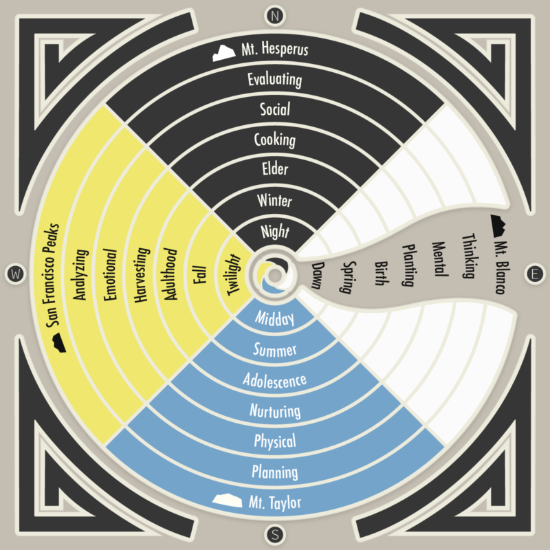
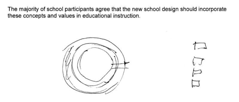
Navajo planning principals follow the concept of “hozhó,” which involves restoring beauty, harmony, and balance in life. This diagram for Dzilth-Na-O-Dith-Hle Community School in Bloomfield, New Mexico, attempts to convey those Diné society founding principles in a graphical form.
Navajo hozhó planning principles diagram.
The design brief contained an explanation of these planning principles, and an architects’s quick sketch of what the design should look like:
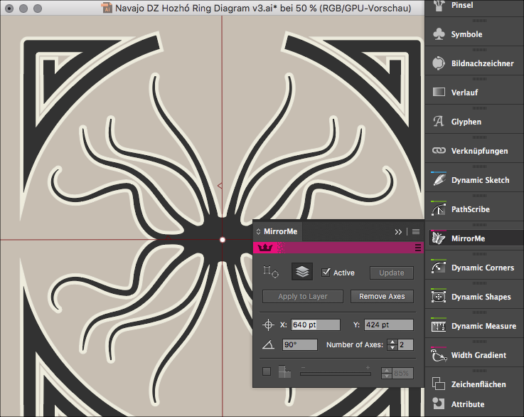
A plugin from Astute Graphics called MirrorMe provides a method to replicate, distribute, and fuse shapes dynamically for instant symmetry.
MirrorMe plugin utility from Astute Graphics for Adobe Illustrator.
In a 2013 DEVELOP3D presentation about ideation, former Luxology/Foundry executive Brad Peebler describes how simply adding symmetry offers a remarkably easy way to generate and explore design ideas, particularly with a suggestion of an organic origin:
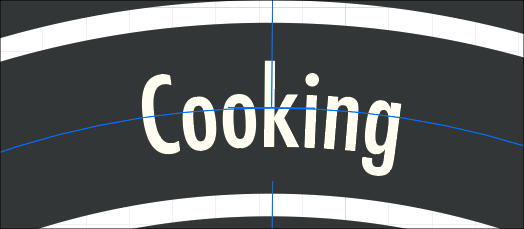
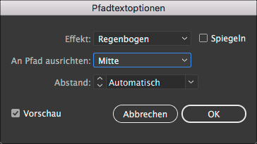
By default, Illustrator’s Type On A Path tool positions text characters along the baseline of a path shape. But aligning along a path’s midline may offer more flexibility for adjustments.
Align text along the midline of a path for easier positioning.
To change this behavior, invoke the the menu command Type > Type on Path > Type on Path Options, then choose “align to path: Center”.
Many of the Wacom drawing pens I’ve used over the years have failed in the same way, gradually developing a stress fracture within the plastic barrel. When that crack widens, the stylus’s internal circuit board can slip out of place and cause the drawing nib to retract unexpectedly.
That crack in the plastic casing leads to a mushy feel to the pen, loose enough to make the pen feel wobbly and unsteady. An unstable nib produces unreliable drawing results, spewing digital ink all over like an irritated cephalopod.
Reseating the barrel will temporarily fix the problem, as will a dab of plastic glue. So far, a more reliable solution has been a simple nylon cable tie.
Unsightly, but effective.
Other stylus models like the rotation-aware Art Pen don’t seem to be as susceptible to such a break, though the inner structural design looks identical.
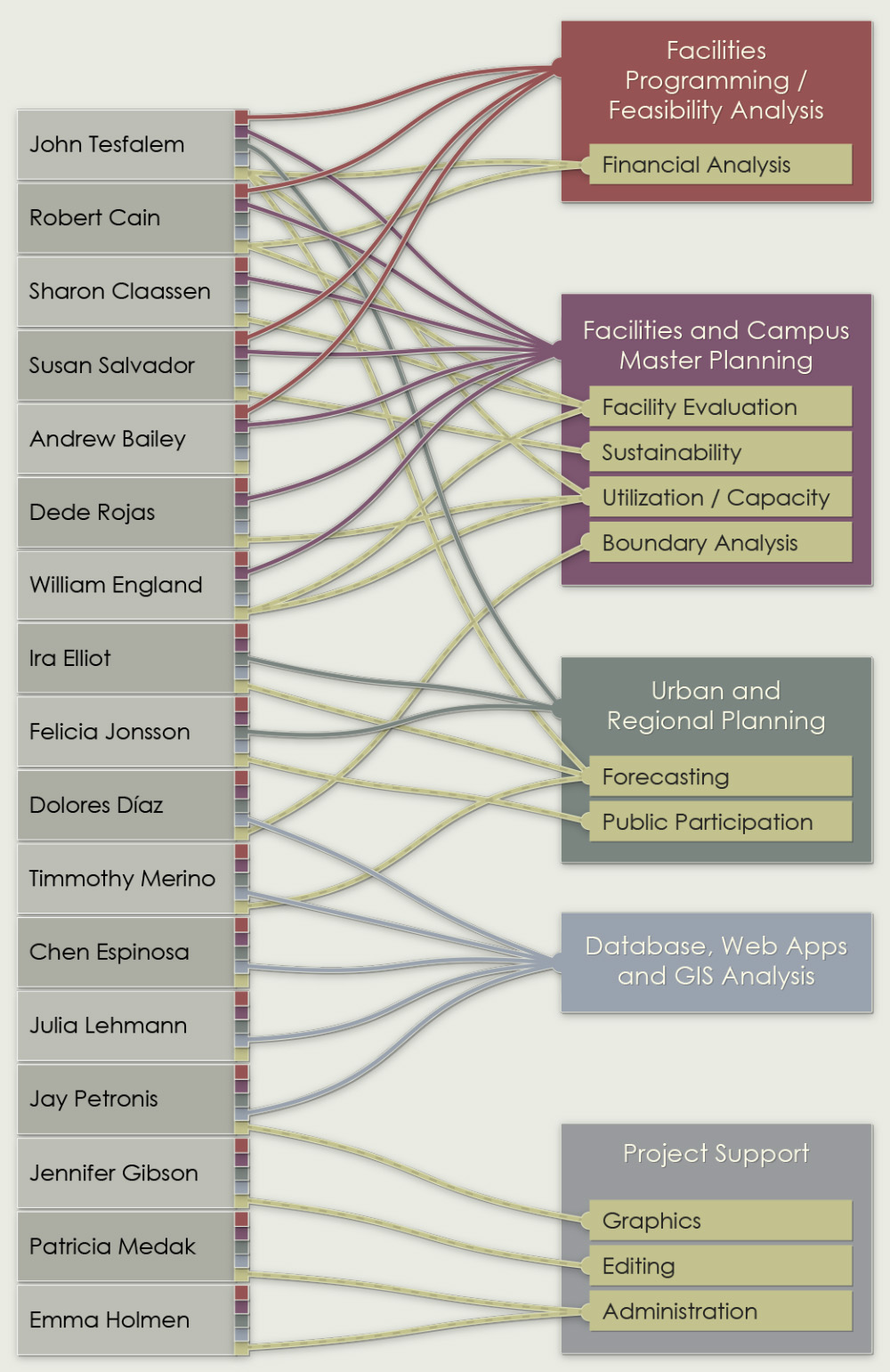
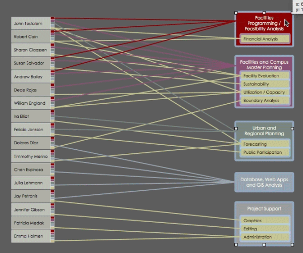
A bare corporate staffing diagram, or org chart, tends to express little more than an organization’s hierarchy, meaningless to outsiders. Or it may inadvertently make a statement about the institution’s convoluted bureaucracy.
This 2013 diagram attempts to convey the capabilities of a flat-level corporation, calling attention to the specialities of each contributor.
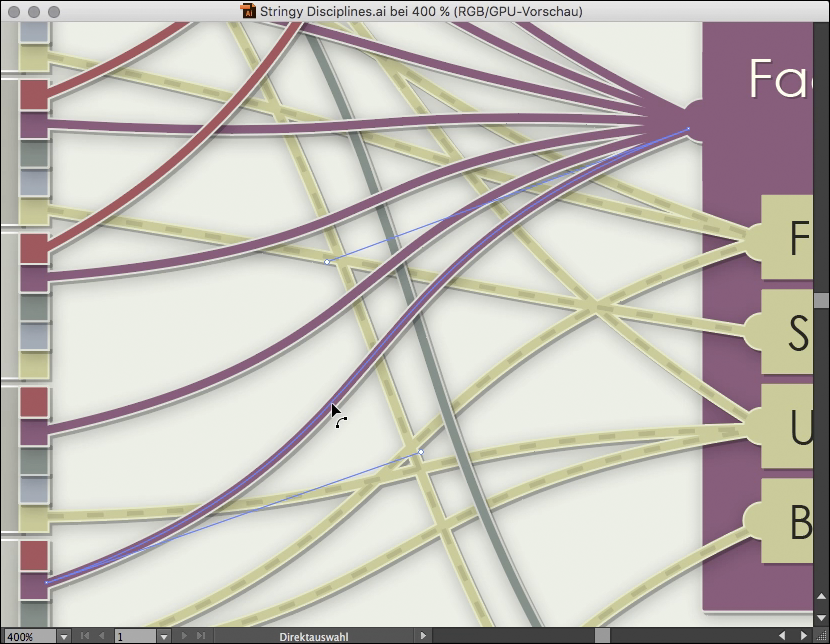
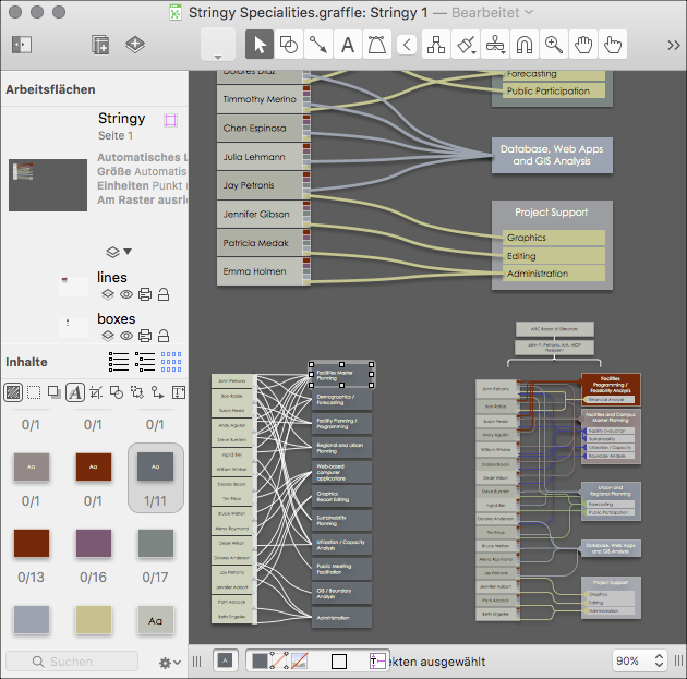
The diagram’s basic structure of boxes and lines originated in OmniGraffle, a Mac drawing application well suited for visualizing relational information.
OmniGraffle’s connection lines can anchor themselves to magnetic points on each piece of geometry. Adjusting the position of the objects produces tension and slack in the connection lines.
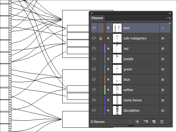
Next, the rough OmniGraffle diagram went to Adobe Illustrator for cleanup and refinement. As of version 6, OmniGraffle’s vector export discards layer structure. But Illustrator’s selection tools can quickly isolate elements and sort them back into layers.
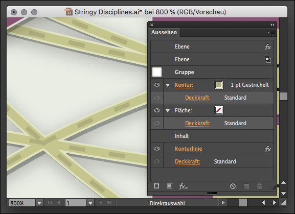
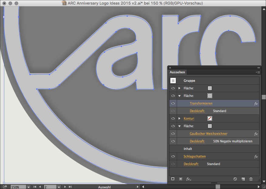
A shaded circle in the layers palette indicates that the layer, object, or group has a dynamic effect attached. The appearance palette contains a list of these applied effects and provides a way to adjust their parameters. Objects placed within an effect-laden container inherit those graphic styles automatically.
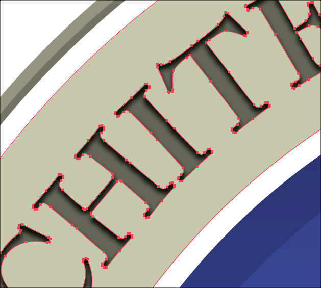
Many paths are simple two-point Bézier curves, easily adjustable using Illustrator’s pen tools.
The logo’s bluish rectangle containing lowercase lettering has remained unchanged since 1976.
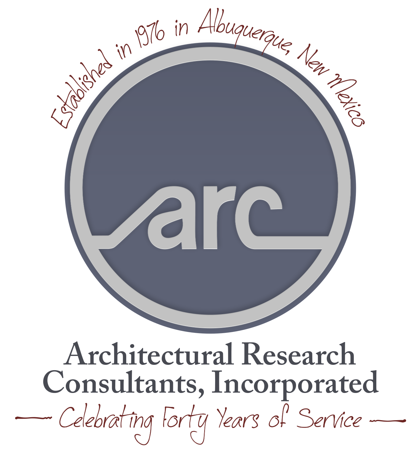
Yellow “40th Anniversary” tag. Red “Est. 1976” badge. Ornate ring of text. Text ring drop shadow depth effect in Illustrator.This circular design uses a hierarchy of layer styles (defined in Illustrator’s Appearance palette) to mimic bevels and shading.
Circular design with embossed edges.
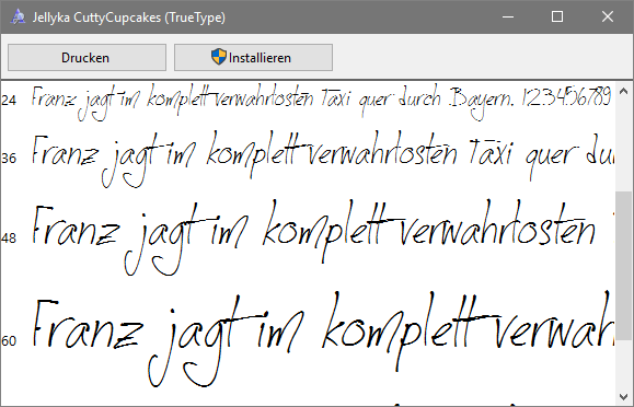
Layer-based design attributes in Illustrator’s Appearance palette.The casual handwritten typeface is Jellyka CuttyCupcakes by Jessica “Jellyka Nerevan” Lapointe.
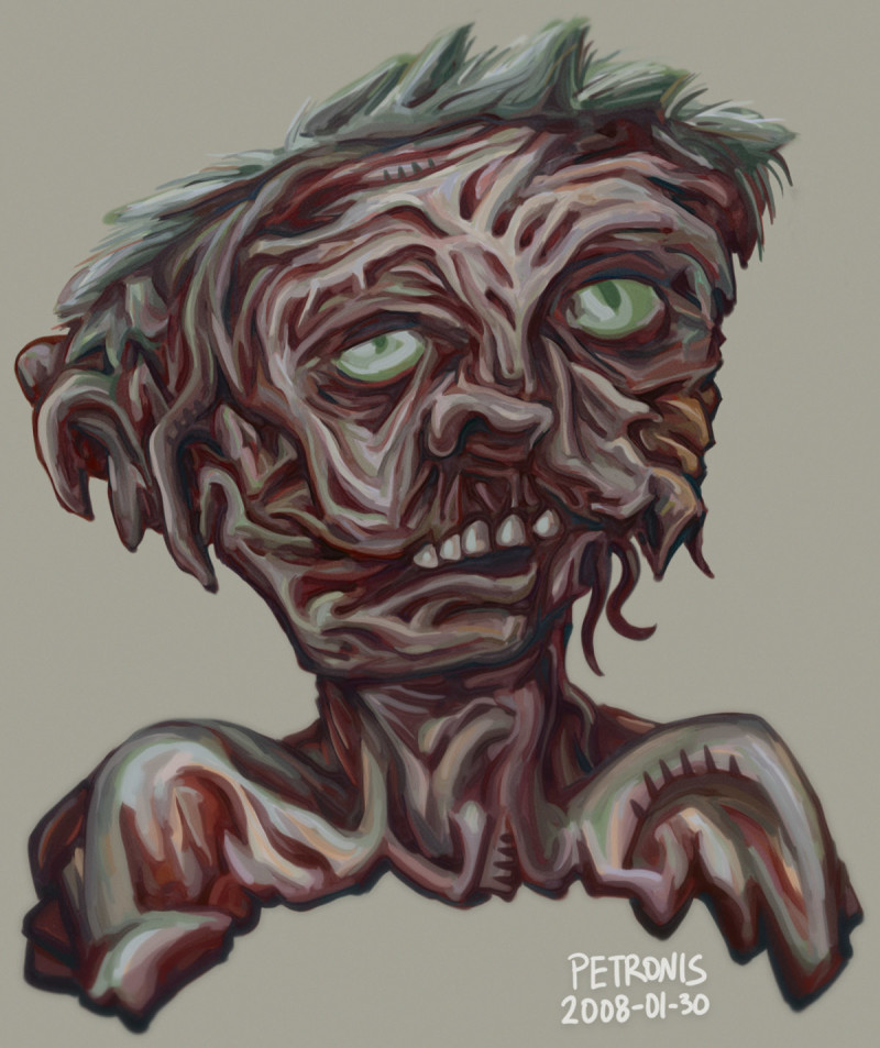
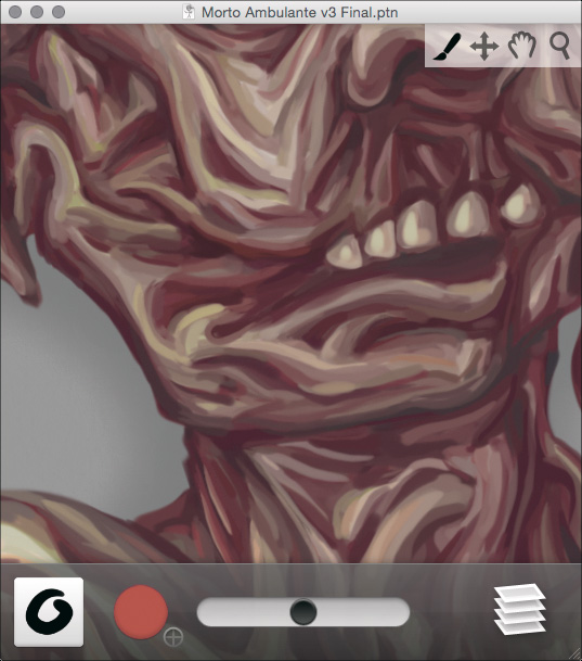
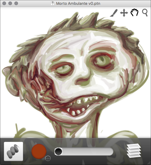
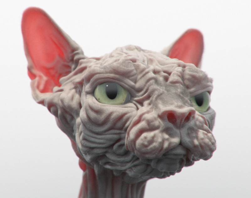
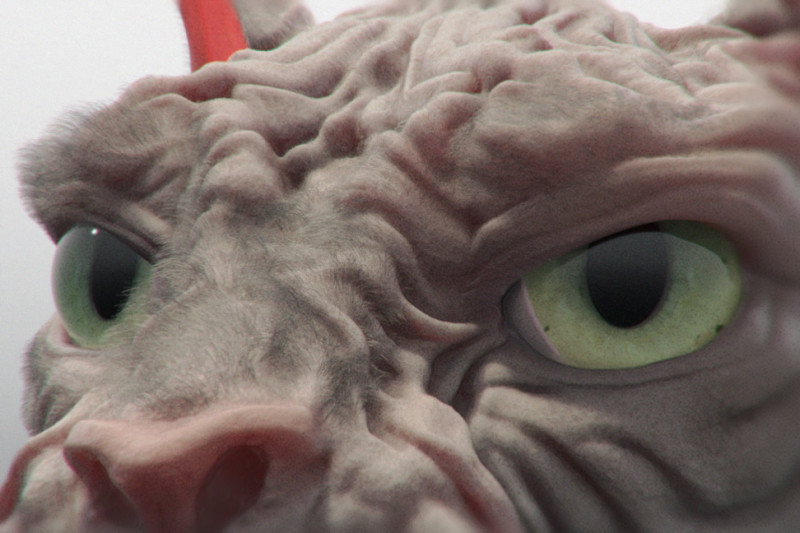
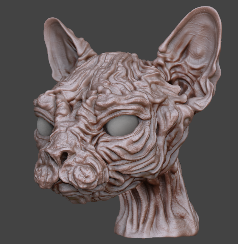
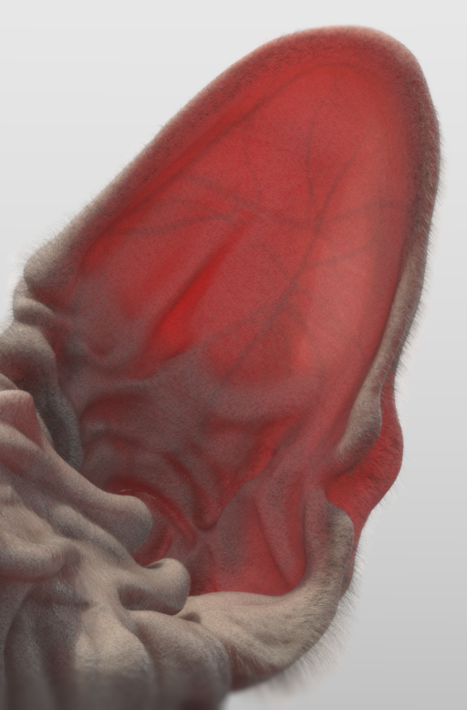
Wrinkly feline project constructed using Pixologic ZBrush 4 and The Foundry modo 701 in 2013:
Wrinkles vaguely reminiscent of those of a sphynx kitty.
(The human-headed, lion-limbed, mythological desert beast fond of riddles is a Sphinx. The kind that meows is probably a Sphynx.)
Fuzzy papier mâché cat snout.
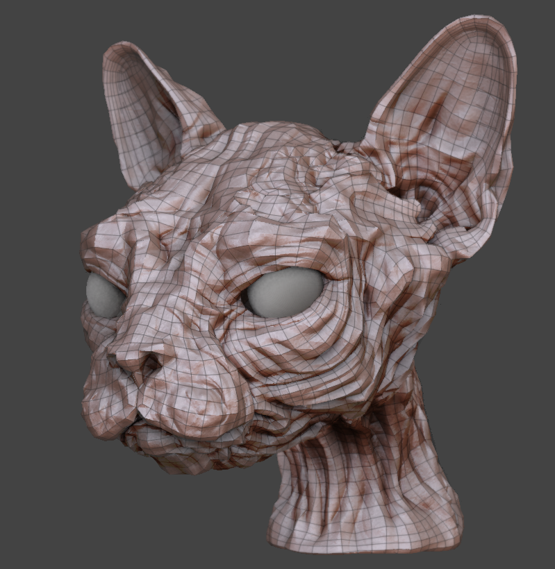
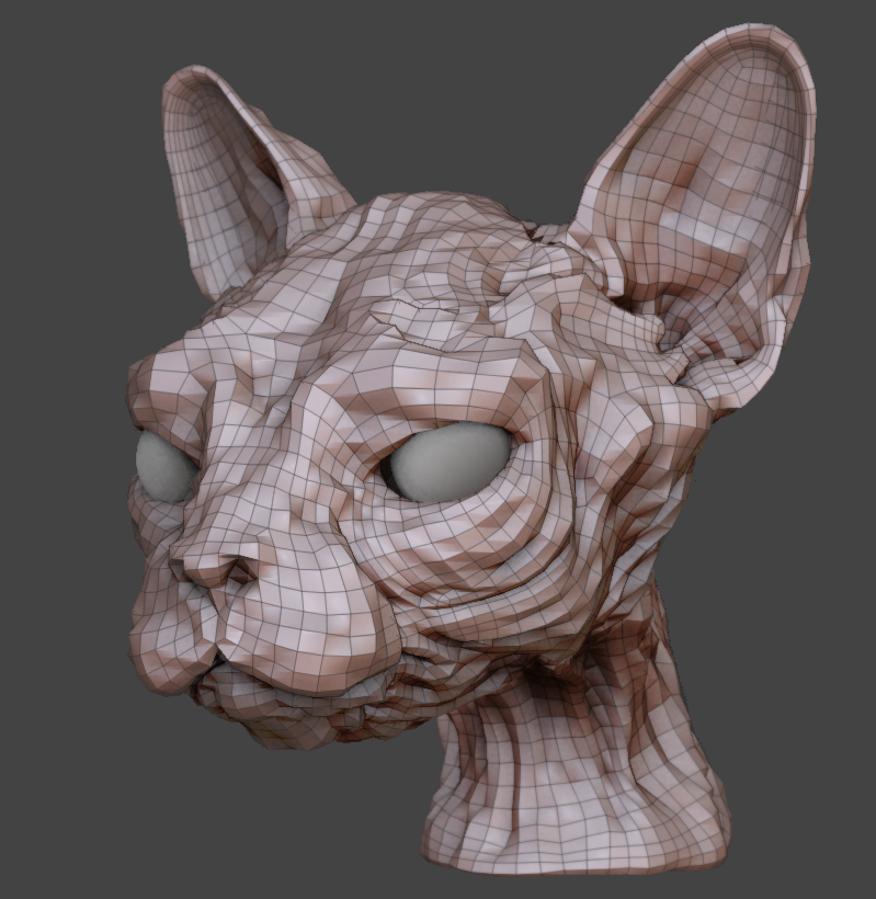
Originating as a sphere in ZBrush, the kitty model grew increasingly detailed with sculpting techniques and DynaMesh topology tools. Unrefined ZBrush geometry can become dense, inefficient, and extermely slow. Fortunately, ZBrush offers various utilities to drastically simplify mesh information without sacrificing surface detail.
This project employed the process of subdivision re-projection and 32-bit displacement maps.
ZBrush mesh at its highest subdivision level.
ZBrush mesh with displacement enabled.
ZBrush mesh at its lowest subdivision level.
A fuzzy ear’s subsurface scattering.
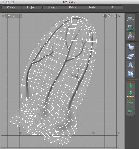
Veins locked into place using modo’s UV editor.
The cat’s yellow eye color and texture originate from a manipulated image of a human iris.
Yellow iris texture map in Pixelmator.
A morph map in modo controls the eye’s level of pupil dilation.
Stretchable iris geometry.
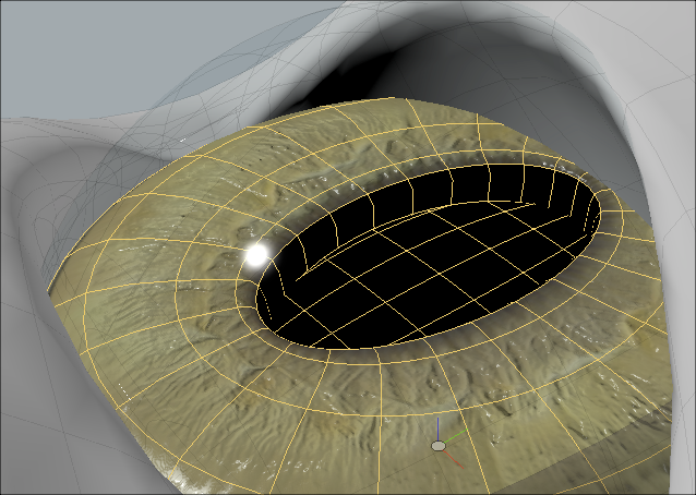
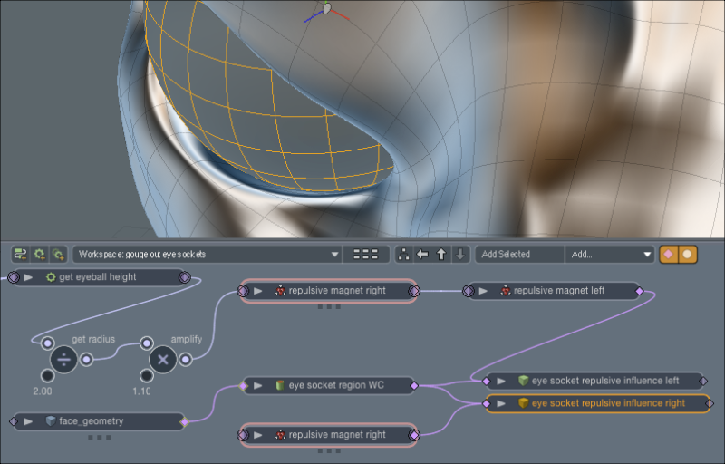
A spherical magnet deformer gently squishes geometry out of the way, carving out a comfy socket for the eyeball. This allows the eye geometry to swivel around without intersecting with other meshes.
A magnet deformer helps the eyeball geometry fit neatly into its socket.
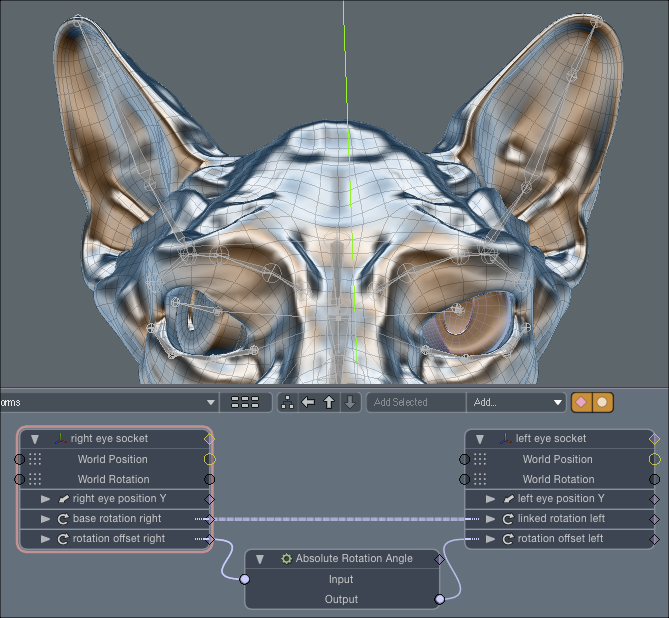
The eyes remain synchronized to each other using channel links. Morph maps and linked deformers ensure that the surrounding facial tissue stretches and slides as the eyes move.
Eyeball motion linked together using modo’s schematic panel.
A simple facial rig provides a limited range of motion to the jaw, ears, and neck.
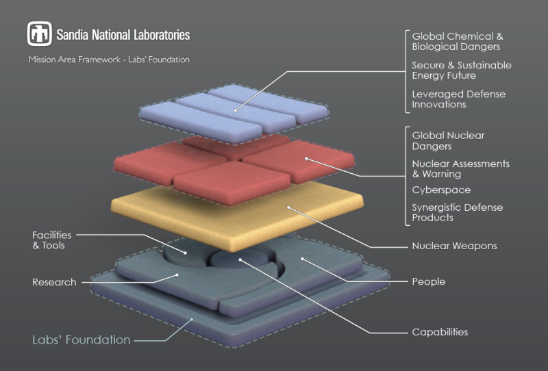
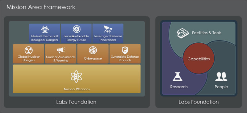
Sandia National Laboratories (SNL) is one of the world’s leading nuclear and energy research facilities. This 2014 ARC diagram was part of SNL’s Five-Year Facilities and Infrastructure Plan (FY 2015-2019), and attempted to visually describe the labs’ organizational framework.
SNL foundation multi-colored slab diagram.
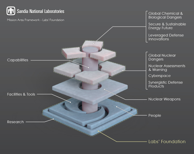
SNL foundation cylindrical slab diagram variation.
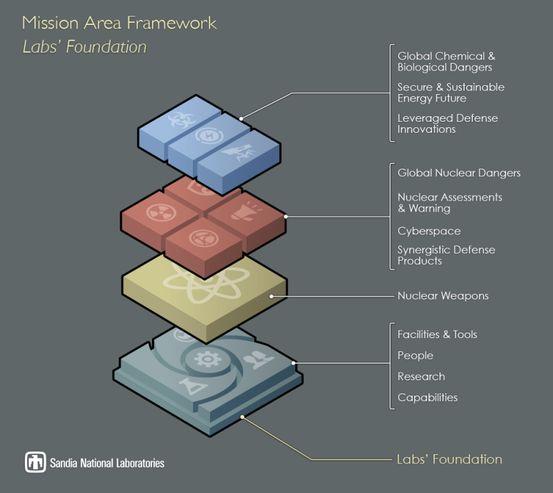
Two-dimensional diagram version from The Omni Group’s OmniGraffle design application.
2D OmniGraffle version.
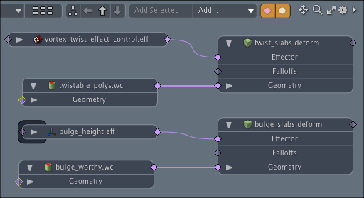
Three-dimensional variations of the diagram used weight containers and deformers within The Foundry’s modo application. In modo, a weight container specifies which of an object’s polygons are susceptible to effects like squishing and twisting. The nodes in this Modo schematic view depict the strength and range of some twist and bulge deformer effects.
Schematic view in modo.
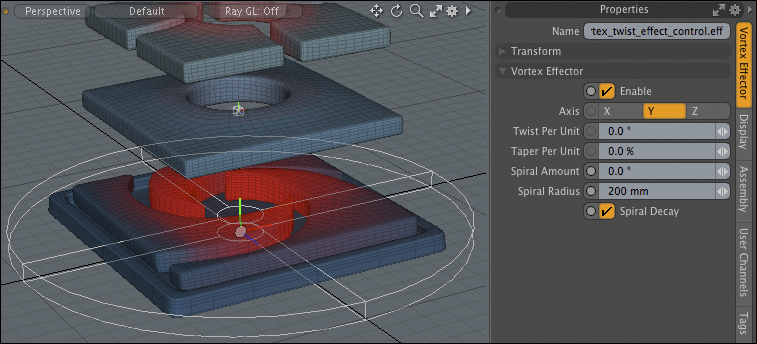
Once wired together, polygons within a weight container (depicted in red below) will bulge and twist more readily than other polygons. Such effects can be animated over time and are non-destructive, making it easy to revert the source geometry back to its original rest state.
The Foundry Modo weighted rotational deformer at 0°.
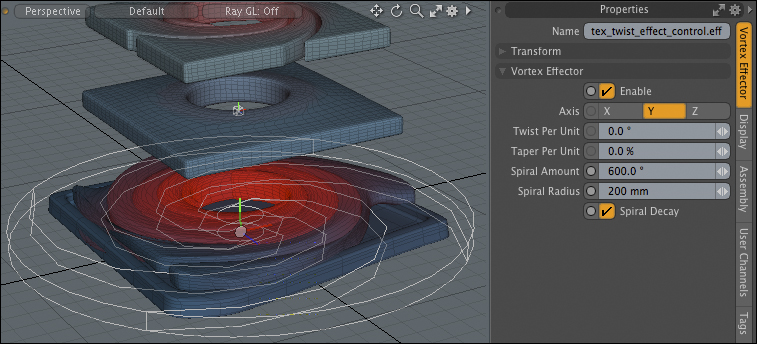
The Foundry Modo weighted twist deformer with a spiral intensity of 600°.